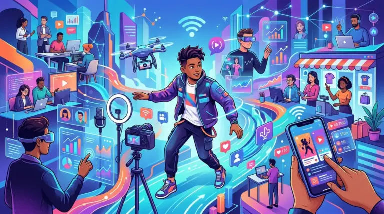


The transition of the smartphone from a communication utility to the primary terminal for global media consumption is no longer a trend—it is a completed takeover. For publishers, agencies, and creators, the "mobile-first" mantra of the last decade has evolved into a "mobile-only" reality for the vast majority of target audiences. In the current landscape, the average adult spends over four and a half hours daily on mobile devices, with nearly 90% of that time spent within apps rather than mobile browsers. This shift has fundamentally rewritten the rules of content distribution, user acquisition, and monetization.
Understanding this dominance requires looking beyond simple screen time. The smartphone has become the central nervous system of digital life because it integrates hardware-level identity, biometric payments, and real-time distribution into a single, pocketable interface. For those managing digital brands, the challenge is no longer just "fitting" content onto a smaller screen; it is about surviving in an ecosystem defined by fragmented attention and high-velocity discovery.
The Verticalization of Media and the 9:16 Hegemony
The most visible sign of smartphone dominance is the total shift in aspect ratios. For fifty years, media was horizontal. The rise of TikTok, Instagram Reels, and YouTube Shorts has forced a pivot to vertical video (9:16), which now commands the highest engagement rates across almost every demographic. This is not merely an aesthetic choice; it is a physiological one. Users hold their phones vertically 94% of the time. Forcing a user to rotate their device creates a point of friction that modern attention spans rarely tolerate.
Best for: Social-first brands and news publishers aiming to capture Gen Z and Millennial traffic through high-frequency, short-form storytelling.
From a production standpoint, this means creative teams must now lead with vertical assets rather than treating them as social-media afterthoughts. High-density information—such as data visualizations or news tickers—must be redesigned to live in the center-third of the screen to avoid being obscured by app UI elements like "Like" buttons or caption overlays.
The Collapse of the Traditional Marketing Funnel
In the desktop era, the customer journey was often linear: see an ad, search for the product, visit a website, and eventually convert. The smartphone has collapsed this funnel into a single, frictionless event. Social commerce integrations allow users to discover, research, and purchase a product without ever leaving the host application. This "in-app" ecosystem is powered by saved payment credentials and biometric authentication (FaceID/TouchID), which remove the high-drop-off moment of entering credit card details.
- Instant Discovery: Algorithmic feeds replace active search as the primary discovery engine.
- One-Tap Conversion: Integration with Apple Pay and Google Pay reduces checkout time to seconds.
- Post-Purchase Engagement: Push notifications provide a direct line for retention that email marketing struggle to match in open rates.
For agencies, this means the "website" is often no longer the destination. It is the backend infrastructure. The actual "storefront" is the social feed or the app interface. If your mobile site requires more than two taps to reach a checkout or a lead form, you are likely losing over 50% of your potential conversions to friction.
Pro Tip: Prioritize "Cumulative Layout Shift" (CLS) in your mobile performance audits. On a small screen, even a 10-pixel jump when an image loads can cause a user to mis-click, leading to immediate site abandonment and a negative signal to search engines.
Mobile as the Identity and Privacy Gateway
The smartphone is the only device that is truly personal. While a desktop might be shared in a household, a phone is tied to a specific biometric profile. This makes it the ultimate tool for identity-based marketing, but it also makes it the front line of the privacy wars. The introduction of Apple’s App Tracking Transparency (ATT) framework significantly altered how publishers and advertisers track users across the mobile web and apps.
This shift has increased the value of "first-party data." Brands that can convince a user to download their app or sign up for a mobile-optimized newsletter gain access to direct communication channels that are not mediated by third-party cookies. For publishers, the goal is now to move users from "anonymous mobile browser" to "authenticated app user" as quickly as possible to maintain data continuity.
The Death of the URL and the Rise of the Walled Garden
We are witnessing the slow erosion of the open web. In a mobile-centric world, the URL is becoming invisible. Users navigate via icons, notifications, and "link in bio" prompts. This creates a "walled garden" effect where platforms like Meta, ByteDance, and Google aim to keep the user within their ecosystem for the duration of their session.
For SEO professionals, this means optimizing for "in-platform" search is just as critical as traditional SERP optimization. If your content isn't discoverable through the internal search engines of TikTok or Instagram, you are missing the primary discovery phase of the modern consumer. Content must be tagged, captioned, and formatted specifically for these internal algorithms to ensure it surfaces in the "For You" or "Explore" sections.
Technical Imperatives for Mobile-First Publishers
Speed is the only currency that matters in mobile media. A one-second delay in mobile load times can impact conversion rates by up to 20%. To compete, publishers must adopt specific technical standards:
1. Server-Side Rendering (SSR): To ensure that the "First Contentful Paint" happens almost instantly, regardless of the user's connection speed.
2. Edge Delivery: Using CDNs to serve content from the physical location closest to the user to minimize latency.
3. Asset Compression: Implementing Next-Gen image formats like WebP or AVIF to reduce payload without sacrificing the visual quality expected on high-resolution Retina displays.
Optimizing for the Pocket-First Economy
To thrive in a media landscape centered on the smartphone, businesses must stop treating mobile as a "version" of their digital presence and start treating it as the core. This requires a shift in both creative and technical strategy. Start by auditing your current user journey on the oldest supported iPhone or Android device in your analytics—if the experience is sluggish or cluttered, your high-end desktop experience is irrelevant.
Focus on reducing the distance between a user's intent and the final action. Whether that is reading an article, watching a video, or buying a product, every tap is a potential exit point. Streamline your UI, leverage native mobile features like haptics and biometrics, and ensure your content is produced for the vertical orientation that defines the modern era. The smartphone isn't just a screen; it is the primary lens through which the world interacts with your brand.
Frequently Asked Questions
How does mobile-first indexing affect my desktop rankings?
Google predominantly uses the mobile version of a site's content, crawled with the smartphone agent, for indexing and ranking. If your mobile site has less content than your desktop site, or if its performance is poor, your rankings across all devices will likely suffer.
Is an app necessary for every digital brand?
Not necessarily. While apps offer better retention and data, they require significant maintenance and user acquisition costs. A highly optimized Progressive Web App (PWA) can often provide the speed and "app-like" feel of a native application without the friction of an App Store download.
Why is vertical video performing better than horizontal video even on platforms that support both?
Vertical video occupies more screen real estate on a smartphone, leading to fewer distractions and a more immersive experience. It also aligns with natural one-handed usage, making users more likely to engage with comments, likes, and shares without changing their grip.
What is the most common mistake in mobile UX?
The most common mistake is "fat-finger" errors—placing interactive elements like buttons or links too close together. Mobile targets should be at least 44x44 pixels to ensure they are easily tappable, preventing user frustration and accidental clicks.