

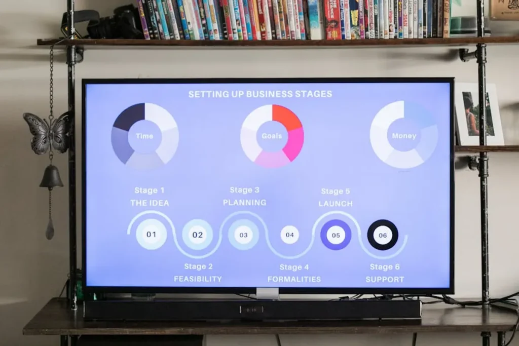
An infographic is a visual representation of information, data, or knowledge, designed to present complex subjects quickly and clearly. In the current digital landscape, where attention spans are fragmented and content overload is the norm, infographics serve as a critical tool for businesses, publishers, and marketers aiming to communicate effectively. They condense intricate data sets, statistical analyses, or sequential processes into an easily digestible format, leveraging graphic design elements to enhance comprehension and retention. For any entity looking to cut through the noise, convey expertise, or simplify a value proposition, understanding the strategic application of infographics is no longer optional—it is a foundational component of impactful content strategy.
What Defines an Infographic?
At its core, an infographic combines text, images, and design to tell a story or explain a concept. Unlike a simple chart or diagram, a well-constructed infographic possesses a narrative flow, guiding the viewer through a specific set of information. Key characteristics include:
- Data Visualization: Translating statistics, facts, and figures into visual elements like charts, graphs, icons, and maps. This makes abstract data more tangible and easier to interpret.
- Conciseness: Distilling complex topics down to their essential points, removing extraneous detail to focus on core messages. The goal is maximum information transfer with minimal cognitive load.
- Storytelling: Arranging information in a logical sequence that builds understanding, often leading to a specific conclusion or call to action. It's not just data display; it's a guided experience.
- Aesthetic Appeal: Utilizing color, typography, and layout to create an engaging visual experience that captures and holds attention. Good design ensures readability and memorability.
- Purpose-Driven Design: Every element, from icon choice to color palette, serves to reinforce the message and achieve a specific communication objective, whether it's to inform, persuade, or entertain.
Key Types of Infographics and Their Applications
The utility of an infographic often depends on its structure, which should align with the type of information being presented and the communication goal. Different formats excel at conveying different narratives:
Statistical Infographics
These are built around numbers and data. They use charts, graphs, and icons to visualize statistics, survey results, and market research.
Best for: Presenting industry trends, academic research findings, performance reports, or compelling data-driven arguments in a way that is immediately impactful for stakeholders or potential clients.
Timeline Infographics
Designed to illustrate events in chronological order, showing progression, history, or future plans.
Best for: Showcasing company history, project milestones, product development roadmaps, or the evolution of a concept. They provide clear context for historical or future-oriented narratives.
Process Infographics
Break down complex processes or workflows into simple, sequential steps.
Best for: Explaining how a product works, outlining a service delivery model, detailing a customer journey, or providing step-by-step instructions. They clarify operational procedures and reduce support inquiries.
Geographic Infographics
Utilize maps and location-based data to visualize demographic information, market reach, or regional statistics.
Best for: Displaying sales territories, population density, global market penetration, or the distribution of resources. They offer spatial insights crucial for strategic planning or audience targeting.
Comparison Infographics
Present side-by-side analyses of two or more items, concepts, or products, highlighting similarities and differences.
Best for: Helping audiences make informed decisions by clearly illustrating the pros and cons of different options, comparing competitor features, or contrasting various solutions to a problem. This format directly supports purchasing decisions.
Why Infographics Matter for Modern Content Strategy
Integrating infographics into a content strategy offers several distinct advantages that contribute directly to commercial objectives:
Visual Communication Efficiency
Humans process visuals significantly faster than text. An infographic can convey information that would require hundreds of words in a matter of seconds, leading to higher comprehension and retention rates. This efficiency is crucial in environments where users skim content and have limited time.
Enhanced Shareability and Backlink Potential
Well-designed infographics are highly shareable across social media platforms, blogs, and news sites. Their visual appeal makes them prime candidates for viral distribution, extending reach far beyond initial publication. Each share and embed, particularly when accompanied by proper attribution, can generate valuable backlinks, improving domain authority and organic search visibility.
SEO Advantages
While search engines primarily read text, infographics contribute to SEO indirectly but significantly. By increasing user engagement (higher dwell time, lower bounce rates), generating social signals, and attracting backlinks, infographics signal to search engines that content is valuable and authoritative. This can lead to improved rankings for related textual content and overall site performance.
Pro Tip: Always include the core data and key takeaways from your infographic in accompanying text on the page. This ensures accessibility for users with visual impairments, provides crawlable content for search engines, and offers a fallback for situations where the image might not load. A comprehensive text summary enhances the infographic's overall utility and SEO value.
Designing Effective Infographics: Best Practices
The commercial impact of an infographic hinges on its design and the quality of its underlying data. Adhering to best practices ensures clarity, credibility, and engagement:
Clarity and Simplicity
Avoid clutter. Every element should serve a purpose. Use a clean layout, consistent visual language, and a limited color palette. The goal is to make complex information accessible, not to overwhelm the viewer with excessive graphics or data points. Prioritize the most critical information and present it prominently.
Data Accuracy and Sourcing
The credibility of an infographic rests entirely on the accuracy of its data. Always use reliable, verifiable sources and cite them clearly within the infographic, typically in a small footer. Factual errors or misleading statistics can severely damage brand reputation and undermine the infographic's commercial utility.
Visual Hierarchy and Branding
Guide the viewer's eye through the information using visual cues like size, color, and placement. Establish a clear hierarchy so the most important data points or conclusions stand out. Integrate consistent branding elements—logos, brand colors, and typography—to reinforce brand identity and ensure recognition, even when the infographic is shared independently.
Leveraging Infographics for Commercial Impact
To maximize the return on investment from infographics, integrate them strategically across your digital channels. Use them in blog posts to explain complex topics, share them on social media to drive engagement, include them in email newsletters to convey key updates, and feature them in sales presentations to simplify product benefits. Consider repurposing existing data or research into an infographic format to extend its lifecycle and reach new audiences. By focusing on clear communication, data integrity, and thoughtful design, infographics become powerful assets for brand building, lead generation, and content authority.
Frequently Asked Questions
Are infographics good for SEO?
Yes, indirectly. While search engines don't "read" images in the same way they read text, infographics can significantly boost SEO by attracting backlinks, increasing social shares, improving user engagement metrics like dwell time, and providing valuable content that keeps visitors on your site longer. Ensure your infographic is accompanied by relevant text, proper alt tags, and a descriptive file name.
How long should an infographic be?
The ideal length varies depending on the complexity of the topic and the amount of data. Generally, infographics should be long enough to convey all necessary information clearly but short enough to maintain viewer engagement. Most effective infographics are between 800 to 2,000 pixels tall, designed for scrolling rather than fitting into a single screen view.
What tools are used to create infographics?
Various tools exist for infographic creation, ranging from professional design software requiring expertise to more accessible online platforms. Professional designers often use vector graphics software for custom illustrations and precise layout control. For those with less design experience, web-based tools offer templates and drag-and-drop interfaces to simplify the process.