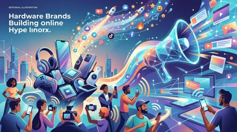
Product obsession is rarely an accident of engineering. While functional utility gets a user through the door, design-driven friction and aesthetic coherence keep them from leaving. In a market where core features are commoditized within months, the differentiator for high-growth consumer tech is no longer what the tool does, but how the tool feels. For marketers and product owners, understanding this transition from "utility" to "obsession" is the difference between a high-churn utility and a cult-status brand with a negative churn rate.
The Mechanics of Haptic Dopamine
Consumer obsession is often anchored in the physical response to digital triggers. When Apple introduced the Taptic Engine, it wasn't just for silent notifications; it was to simulate the tactile click of a physical button on a glass surface. This haptic feedback creates a neurological loop that validates user action. In software, this translates to micro-interactions: the specific "pop" of a liked tweet, the fluid physics of a "pull-to-refresh" gesture, or the subtle color shift of a button under a cursor.
Best for: Mobile-first applications where session frequency is a primary KPI.
These details are not decorative. They reduce the cognitive load required to confirm an action. When a UI responds with the fluidity of a physical object, it triggers the brain's reward system. Startups like Linear or Raycast have built entire user bases by focusing on "latency as a feature." By making the interface respond faster than the human eye can track, they create a sense of "flow" that makes competing, slower tools feel broken by comparison.
The Aesthetic Moat and Brand Identity
In the current SaaS and hardware landscape, design serves as a moat. If two products offer the same API integrations and data processing speeds, the user will gravitate toward the one that aligns with their professional identity. This is why companies like Teenage Engineering can charge a premium for hardware that, on paper, has fewer features than cheaper competitors. Their design language—a mix of industrial minimalism and playful retro-futurism—communicates a specific status.
- Visual Consistency: Using a bespoke design system (like Shopify’s Polaris) ensures that every touchpoint feels like part of a single, reliable universe.
- Intentional Friction: Sometimes, slowing a user down—like a high-end unboxing experience or a guided "first-run" tutorial—increases the perceived value of the product.
- Spatial UI: As we move toward AR and VR, the "physics" of digital objects becomes the primary way users judge quality.
Warning: Over-designing for "delight" can backfire if it interferes with the user's primary task. If an animation takes 300ms but the user's intent takes 100ms, the design is no longer a feature; it is technical debt that will eventually drive churn.
Cognitive Load and the Power of Defaults
The most obsessive products are those that require the least amount of "setup" to feel personal. Design plays a critical role here through the "power of defaults." A well-designed product anticipates user needs through layout. For example, the placement of the "Compose" button in a mail app or the "Search" bar in a browser isn't just about accessibility; it’s about mapping the UI to the user’s mental model.
When design aligns with intuition, the product becomes an extension of the user. This is the "invisible design" philosophy. If a user has to think about how to use a tool, the obsession breaks. The goal is to reach a state where the interface disappears, leaving only the task. This is why minimalist editors like iA Writer or Bear have maintained loyal followings despite the rise of feature-heavy AI note-takers. They remove the "choice paralysis" that comes with too many formatting options.
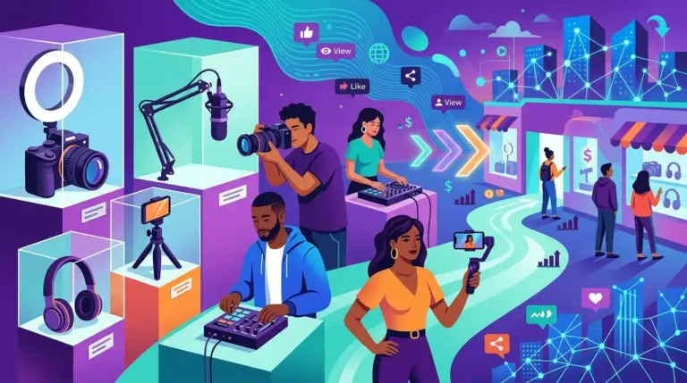
Hardware-Software Symbiosis in the Creator Economy
For creators and digital professionals, the physical hardware is a status symbol. The obsession with "desk setups" on platforms like Instagram and YouTube highlights the importance of industrial design. A product like the Elgato Stream Deck isn't just a series of macro keys; it is a tactile command center that makes the digital act of streaming feel like operating a high-end broadcast studio.
This symbiosis is where commercial value is maximized. When software is designed to take advantage of specific hardware—like the way Instagram optimized its early filters for the specific constraints of the iPhone 4 camera—it creates a proprietary experience that cannot be easily replicated on other platforms. This "lock-in" is driven by the pleasure of use, which is a much stronger retention lever than the pain of migration.
Auditing Your Product for Design-Led Retention
To move a product from a utility to an obsession, agencies and publishers must audit the user journey for "emotional resonance." This isn't about adding more colors; it's about refining the feedback loops that occur within the first 60 seconds of use. If the initial interaction feels clunky, the user will never stick around long enough to appreciate the backend power.
Focus on reducing the time-to-value (TTV) through visual cues. Use progressive disclosure to hide complex features until the user actually needs them. This keeps the interface clean for novices while remaining powerful for power users. Finally, invest in typography and spacing. These are the "invisible" elements of design that signal professional quality and build trust before a single line of copy is read.
Design Strategy FAQ
Does high-end design always lead to higher conversion?
Not necessarily. High-end design increases "perceived value" and "trust," which are precursors to conversion. However, if the design creates too much friction or looks "too expensive" for a budget-conscious market, it can actually deter users. The design must match the market's expectations.
How much should a startup spend on custom UI vs. using a library?
In the early stages, use a library (like Tailwind or Material UI) to ensure functional reliability. Custom UI should be reserved for the "core loop" of your product—the 20% of the app where users spend 80% of their time. That is where the obsession is built.
What is the most common design mistake that kills user obsession?
Inconsistency. If the mobile app feels like a different product than the desktop version, or if the marketing site promises a sleek experience that the actual dashboard doesn't deliver, the "spell" is broken. Consistency builds the brand's reality in the user's mind.
Is "dark mode" still a requirement for consumer tech?
For any product used for more than 30 minutes a day, or used at night (like entertainment or coding tools), dark mode is no longer a feature—it is a baseline expectation. Omitting it signals a lack of empathy for the user's physical environment.